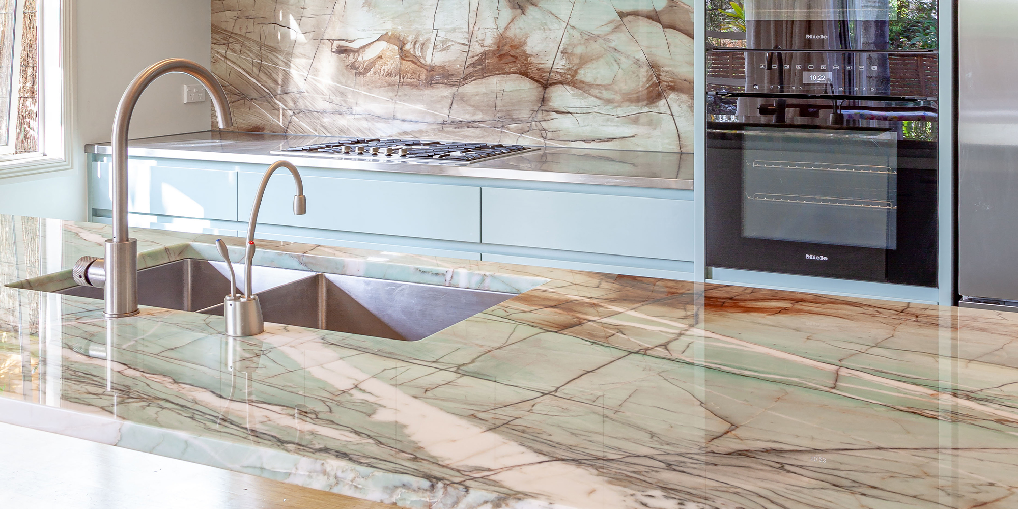
Choosing the colour palette for her client's new kitchen was a fairly natural process, as their home was layered with different shades of green – in the wall-hanging art and the pottery dotted around the living room.
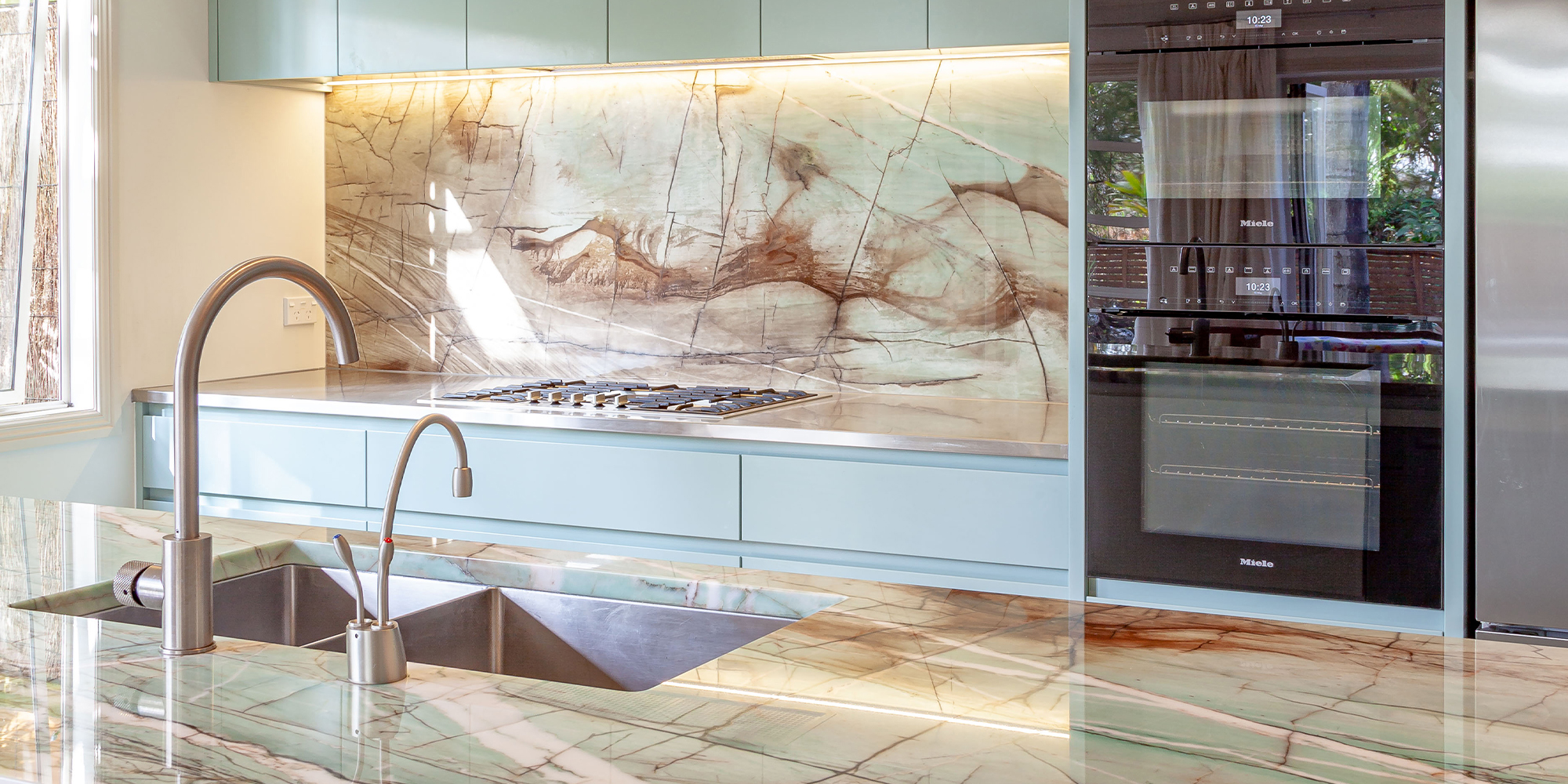
“My clients, a professional couple with older children that have left home, came to us wanting something clean and uncluttered, easy to maintain, and also to create a scullery and extra storage in their existing laundry space. Most of all, though, they wanted colour,” says the designer. “The one thing they were certain about, right from the start, is that they didn’t want a white kitchen.”
The cabinetry is the largest surface in any kitchen – it therefore sets the tone for the rest of the space. Most people opt for white, or shades thereof – and for good reason. It’s easy. Everything goes with white, and when it comes to selling, white doesn’t offend anyone.
With this kitchen, however, Michelle’s clients were not putting in a new kitchen for anyone else, or for whoever was going to live in the house in the future – they were doing it for themselves, for right now.
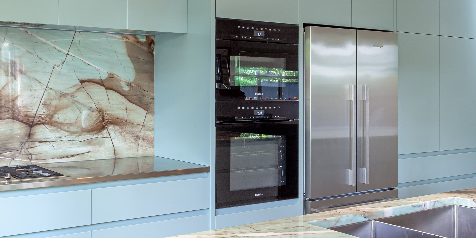
"Most of all, though, they wanted colour. The one thing they were certain about, right from the start, is that they didn’t want a white kitchen.”
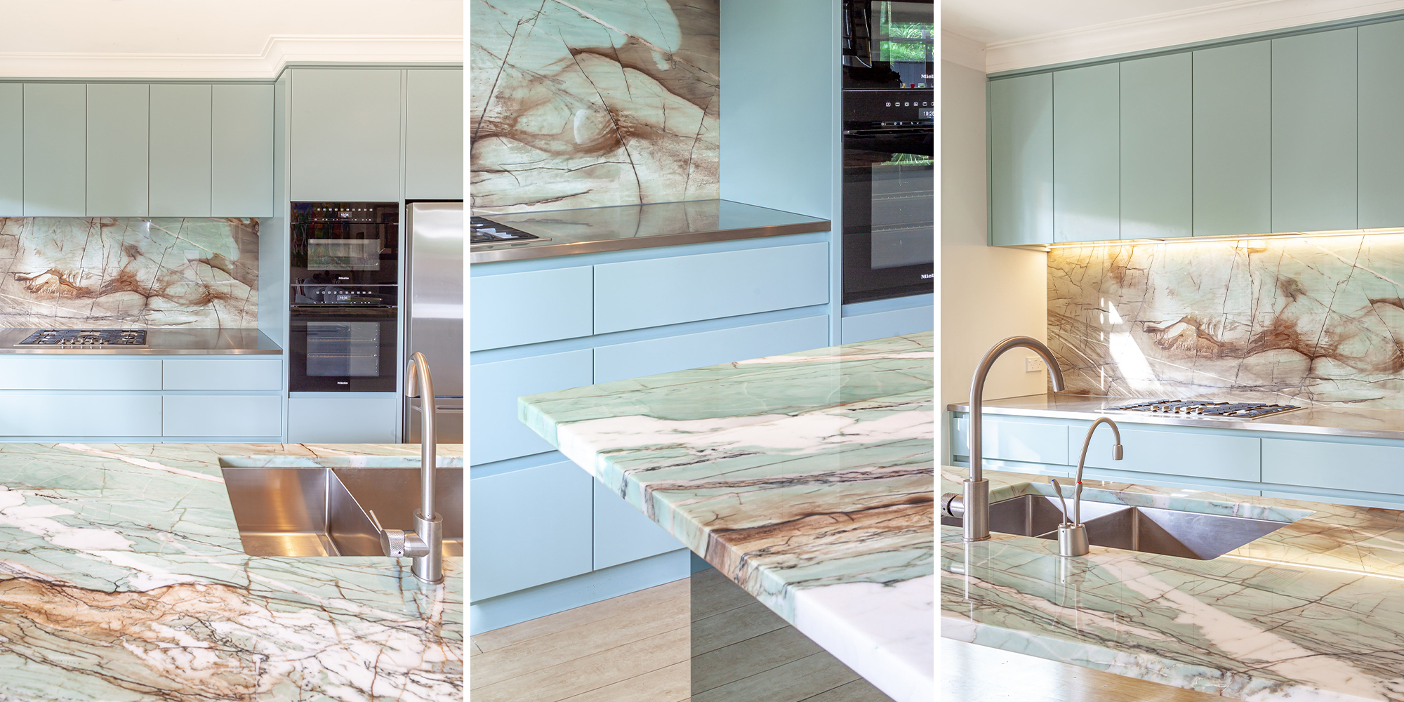
“With the base colour of the kitchen established as a deep, rich green, I then took my clients to select the natural stone for their benchtop, waterfall end and splashback – and they instantly feel in love with a striking slab of Macchiato Quartzite, with contrasting folds of teal and coffee brown, from where it gets its name.”
Interestingly, however, the shade of green that Michelle had chosen for the cabinetry didn’t match the lighter, aqua shades of the stone. So, it was back to the stone supplier with the colour palette underarm, to match a new shade of green to the stone her clients had fallen in love with. And she did so, perfectly.
Looking at the final polished benchtop, it’s almost inconceivable that the forces of nature have come together to forge such a dazzling palette of colour – and using the same stone for the splashback enhances the effect, sitting behind the cooktop like a pic of modern abstract art.
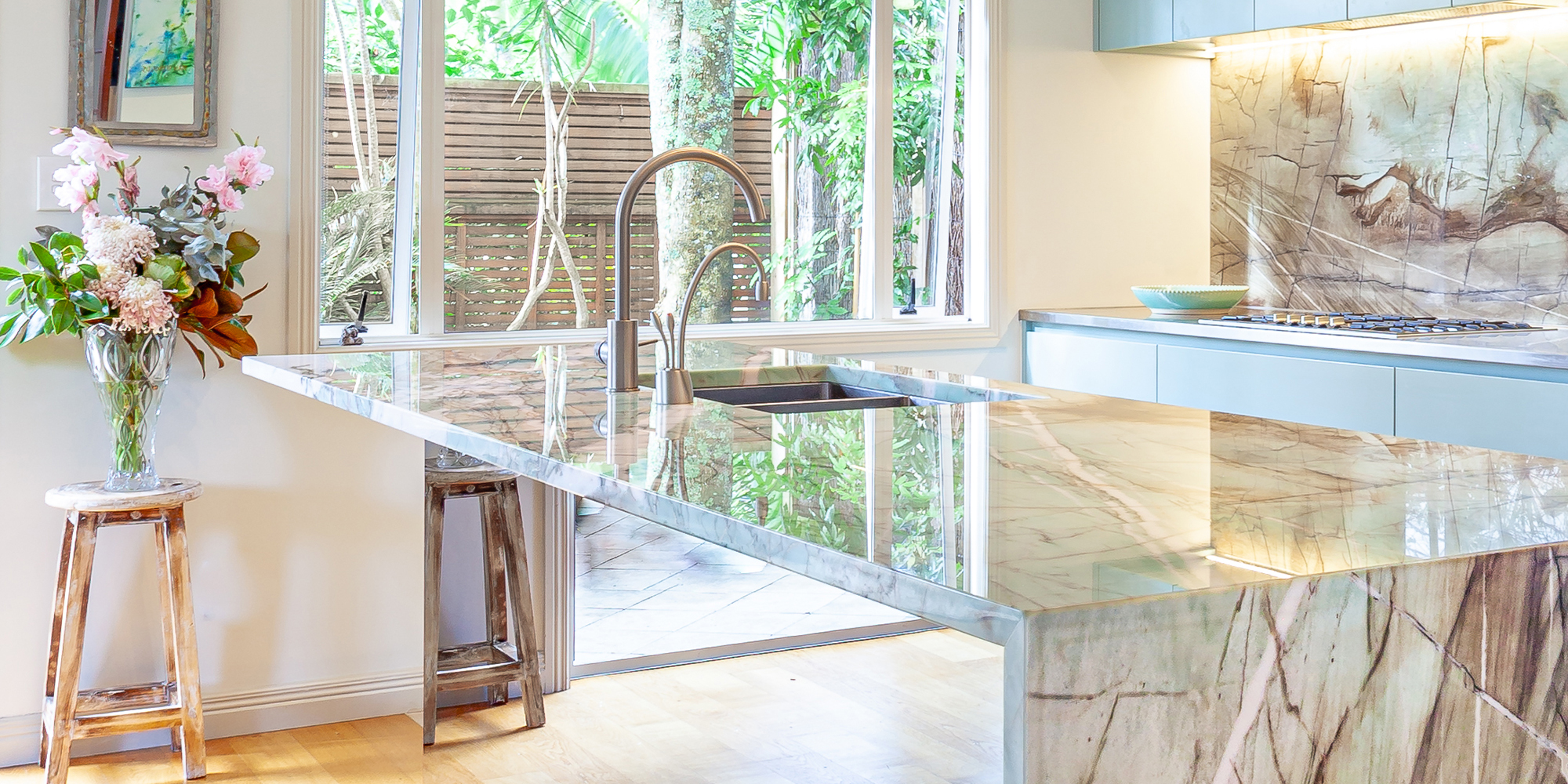
For the practical surfaces, hardwearing and easy-to-clean stainless steel was used on the hob bench, as well as in the scullery. Michelle also hid the fridge and pantry behind tall, handle-less doors, to give her clients the clean, uncluttered effect they asked for. She even gave them a ‘hidden’ drinks cabinet, also disguised within the cabinetry along the back wall.
The designer had originally specified a plain white finish for the front of the island, but her clients found it a little too stark and bright, alongside the soft colours of the stone. As a solution, locally based Image Glass was brought in to overlay the white finish with a smoky glass mirror, creating a startling ‘floating’ effect that seamlessly finishes off the kitchen.
“The best part of the whole process for me was when we saw the stone for the first time and my client commented that the colour reminded her of the fish-and-chip shop back home in Scotland! I had to laugh,” says Michelle.
